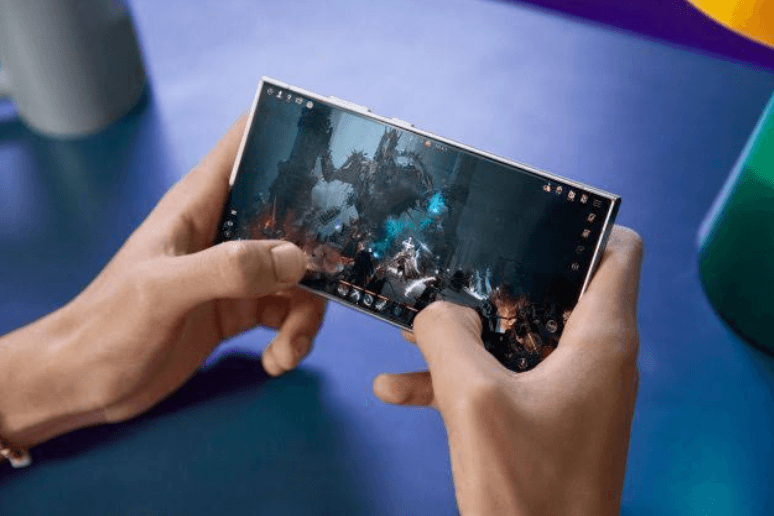

A phone changes the way a game is used before the software even starts. There is no mouse, no large desk, and no wide monitor. Most actions happen with one or two thumbs while the device is being held at the same time. That makes mobile game design a physical problem as much as a visual one. Buttons can look perfectly clear and still be awkward to reach. A layout can appear neat in a mockup but feel uncomfortable after a few minutes in the hand. Instant games make these differences easy to notice because interaction tends to happen quickly. When the controls sit where the fingers naturally move, the experience feels lighter. When they do not, even a fairly simple game can become irritating.
Thumb reach decides more than screen size
A phone screen may be small, but not every part of it is equally easy to touch. The lower half is usually more comfortable when the device is held in one hand. Reaching the top corner often means stretching the thumb or changing grip. That becomes noticeable when the same control is used repeatedly.
Someone searching for a jetx app may think mainly about mobile access, but comfort depends just as much on where the interaction sits once the game is open. Frequently used controls work better when they stay close to the natural resting position of the thumb.
That does not mean every button has to be placed at the bottom. It means the interface should recognize which actions happen often and which ones can live farther away.
Small buttons create bigger problems on touchscreens
A mouse pointer can land on a tiny icon with reasonable accuracy. A fingertip cannot. It covers more space, hides part of the display during a tap, and moves less precisely when the phone is being held at the same time.
This is why tightly packed controls can cause trouble. Two buttons may look separate on screen yet still be too close for comfortable use. One accidental tap is usually minor. Repeated mistakes feel different because the interface begins working against the user.
A better mobile layout leaves breathing room around the main controls. Secondary options can be smaller or moved away from the active area. The most frequently used action should be easy to hit without careful aiming. That matters even more in an instant game, where attention may already be fixed on changing information elsewhere on the screen.
One hand changes the whole layout
People do not always hold a phone with both hands. A game might be opened while standing, sitting on public transportation, or holding something else. In those situations, one thumb may be doing almost everything.
Designing for that grip means thinking about distance. A button near the opposite edge of the screen may require the user to loosen the grip just to reach it. That raises the chance of a missed tap or even dropping the device.
Several practical choices can make one-handed interaction easier:
- Place frequent actions within a comfortable thumb area.
- Leave clear space between neighboring controls.
- Keep less-used options away from the main interaction zone.
- Avoid forcing repeated movement between opposite edges.
- Keep the central action visible while the thumb is moving.
None of these choices is dramatic on its own. Together, they can make a mobile game much easier to handle.
The finger should not hide the information
Touchscreens create another problem that desktop interfaces do not have. The input device is also something that physically covers the display.
When a thumb presses near changing information, the user may miss part of what is happening. This can be especially awkward in fast games where the screen changes while a control is being touched.
The easiest fix is separation. Controls can sit in one area while the changing information remains somewhere the finger does not regularly cover. The distance does not have to be large. It only has to be enough to keep the action visible.
JetX belongs to a type of instant game where the main on-screen event needs to remain easy to follow. On a phone, that means visual placement should account for the hand itself, not just the available pixels.
Portrait mode leaves little room for waste
Phones are often held vertically, and that creates a narrow working area. A desktop interface that depends on wide panels or several horizontal menus can become cramped very quickly when moved into portrait mode.
The better approach is usually to decide what actually needs to remain visible. Main controls deserve space. Current game information also needs room. Less-used settings can move into a menu instead of competing with those elements.
Vertical layouts can work well for instant games because the screen does not have to carry a large map, complex inventory, or several permanent side panels. The content can be arranged in layers from top to bottom without making every element tiny.
That is different from simply shrinking a desktop page. Mobile design works better when the layout is rebuilt around the available shape rather than reduced until it fits.
Comfort is often noticed only when it is missing
Most users will never think about thumb zones, tap spacing, or grip changes while playing. They are more likely to notice when something feels awkward.
A control that sits slightly too high can become annoying after repeated use. Two buttons placed too close together can cause mistakes. A value hidden under a finger can make the screen harder to follow at the exact moment the user needs it.
That is why mobile ergonomics matters even in a compact game. JetX does not need a crowded control scheme for the mobile experience to depend on good placement. The fewer actions there are, the more noticeable poor positioning can become.
A comfortable mobile game rarely calls attention to its layout. The hand simply finds the controls, the main information stays visible, and the device does not need constant repositioning. That is usually a better sign of good mobile design than adding more features to the screen.